WEEK #13- Changing something to make it better...
Editing, reworking, scrapping what you started—to start over. It's all part of the process...
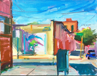
Yesterday Tom and I made our way to Red Hook, Brooklyn to paint on location. I love painting in Red Hook. The skies are open, the buildings face the end of the day sun and have lines that are just pleasing to my eye. PLUS there's not a lot of traffic (foot/cars)
I did have some challenges (my easel leg broke, a strange woman wanted to have a long conversation about her medical condition, finding the right amount of shade to work in reduced some of my choices... etc) But once I got started I was reminded why I love to paint on location. It's almost an emotional experience!
The image below is one of the paintings I did on Conover Street. At a certain point I stepped back and realized the street sign in the middle basically split my painting in half. What to do? I edited. Which meant I needed to rework the sky. (Easier to do in acrylic and oil) and this being an oil painting I had to do a little surgery but it worked out o.k. This also gave me an opportunity to rework the sky with more movement. Susan's art prompt from last week inspired me here... notice how the sky gets pretty dark on top and fades to almost white... (note: Many of you work in watercolor, and here's where thumbnails/sketches show you what you can edit out before you begin. )
So what's the art prompt? Think like a designer this week. Use your sketchbook. Ask yourself, is there something about the subject (landscape, still life, maybe even an imaginary image) that 'takes away' from the more focal part of your image that you want to highlight. Maybe the horizon line needs lifting or lowering... Keep striving for a strong dynamic design. Share what you did, and your thoughts in the process. And always: have fun!
Janet and Susan


Yesterday Tom and I made our way to Red Hook, Brooklyn to paint on location. I love painting in Red Hook. The skies are open, the buildings face the end of the day sun and have lines that are just pleasing to my eye. PLUS there's not a lot of traffic (foot/cars)
I did have some challenges (my easel leg broke, a strange woman wanted to have a long conversation about her medical condition, finding the right amount of shade to work in reduced some of my choices... etc) But once I got started I was reminded why I love to paint on location. It's almost an emotional experience!
The image below is one of the paintings I did on Conover Street. At a certain point I stepped back and realized the street sign in the middle basically split my painting in half. What to do? I edited. Which meant I needed to rework the sky. (Easier to do in acrylic and oil) and this being an oil painting I had to do a little surgery but it worked out o.k. This also gave me an opportunity to rework the sky with more movement. Susan's art prompt from last week inspired me here... notice how the sky gets pretty dark on top and fades to almost white... (note: Many of you work in watercolor, and here's where thumbnails/sketches show you what you can edit out before you begin. )
Janet and Susan


Check out the latest full fledged paintings from this prompt!


Artist Virginia Naughton:
"Thinking like a designer' was such a helpful prompt. Before and during painting, I reassessed with b&w images, trying for keeping the eye moving. I also deliberately painted further away from my surface in hopes of loosening up.


Artist Janet Filemyr:
Here’s my photo and then my watercolor. I did a few studies exploring composition. The final painting is One color, paines grey. I love the value range that paines grey has, it creates drama!
Comments
Post a Comment